

CASE STUDY 01 · B2B MOBILE APP
Fease

A logistics and money hub for Access Consciousness facilitators, so they can spend their energy on the class instead of the spreadsheets.

THE PROBLEM
Planning a class shouldn’t take five spreadsheets.
Access Consciousness facilitators run classes with their awareness, but they plan them in spreadsheets and notebooks, which forces a free-flowing process into rigid steps. Money, venues, snacks and hosts all live in different places.
The admin work drains the time and energy they need for the class itself. And when a host and a facilitator plan together, it takes several meetings to get on the same page.
RESEARCH
I started with people I know.
I have a strong network in the Access Consciousness community, so I designed for the “Intuitive Contributor”: facilitators driven by purpose and drained by linear business tools.
37
cards sorted by 3 facilitators to shape the app structure
Card sort
3
recurring pains: rigid spreadsheets, forgotten details, money anxiety
Interviews
1
persona: the Intuitive Contributor
Synthesis
What I heard
- Insight 1 · Spreadsheets feel restrictive and make planning feel like a chore.
- Insight 2 · Facilitators forget small details, like snacks, and panic the night before.
- Insight 3 · Accounting words (budget, expenses) create anxiety. Supportive questions don’t.
See the synthesis
INFORMATION ARCHITECTURE
One app, shaped like an event.
Three facilitators sorted 37 cards. Their labels were different, but every sort followed the life of an event, so that became the structure.
Creating an event takes three short steps. Then everything lives in one workspace.
SITEMAP
CREATE AN EVENT
WIREFRAMES
From sketch to screen.
I started with low-fidelity flows, then ran moderated tests of a clickable wireframe prototype with 5 people: 2 facilitators, 2 hosts and a client. The task: create an event from start to finish. What I learned shaped the high-fidelity screens.
LOGO & BRAND DESIGN
I designed the Fease brand, too.
Fease is my own product, so I built its identity from scratch: a logo, colors and type that feel light and welcoming, not corporate. It needed to feel like it belongs to the Access community, not to an accounting office.
In testing, every participant described the look as modern, light and engaging.
THE SOLUTION
The solution
SOLVES INSIGHT 1
A 3-step event wizard
Modality, Format, Elements. A long “wall of inputs” became three short screens anyone can finish on a phone.
SOLVES INSIGHT 2
Tasks you can see at a glance
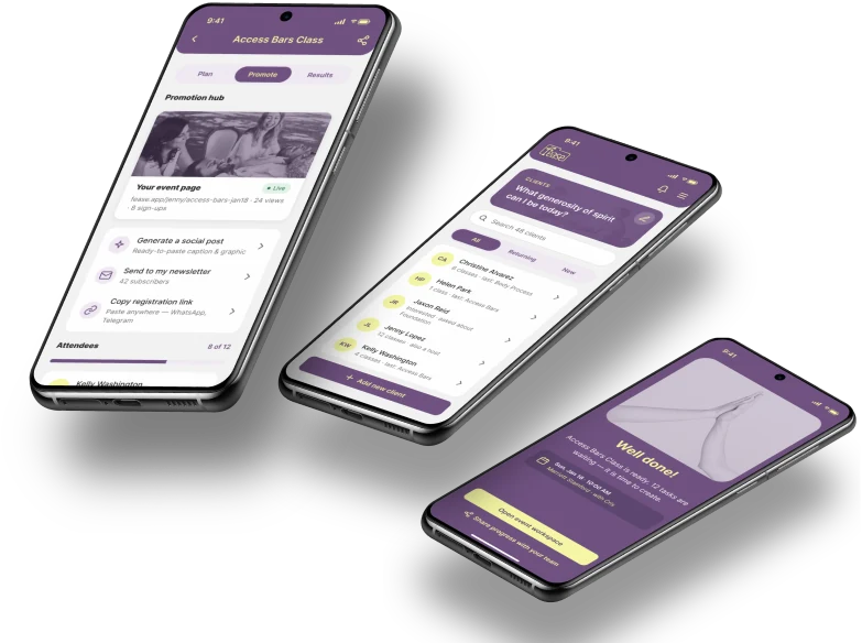
Tasks grouped into Venue, Nourishment and Promotion, plus a progress donut that shows how ready the event is.
SOLVES INSIGHT 3
Questions instead of accounting words
The home screen asks “What creation requires your attention and energy today?” And a “10% For You” account sets part of every event aside for the facilitator.
A CLOSER LOOK
Look into the app
Plan · Promote · Results
Three tabs for the three stages of an event.
Event details
Date, venue, price and team in one card.
Progress donut
How ready each area is, at a glance.
Task groups
Venue, Nourishment and Promotion, each with its own checklist.
TESTING
What testing showed
5/5
created an event start to finish
3 of 5
asked for a shared space with their hosts
100%
missed the top question, hidden by the phone notch
- “10% For You” got the strongest reaction. One tester said it made them feel seen and rewarded.
- Every tester missed the guiding question because the notch covered it. That became my first fix: safe-area padding on every screen.
- Power users asked for “Duplicate event” and “Save as draft”. Weekly classes shouldn’t mean re-entering everything.
“Having everything—the money, the tasks, the venue info—in one spot is a game changer for facilitators.”
WHAT’S NEXT
What’s next
A shared host panel, Duplicate Event and Save as Draft. My goal is to build Fease with a team and launch it for the Access Consciousness community.
What I’d do differently
Recruit beyond my own network sooner, and design the host’s side alongside the facilitator’s from the start.

NEXT CASE STUDY
Resident PortalMaking a maintenance request take seconds, not twenty drop-downs.