

CASE STUDY 02 · B2B PROPERTY MANAGEMENT APP
Resident Portal
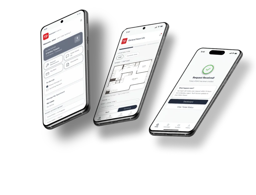
A redesign of the maintenance request, so reporting a broken toilet feels like sending a text, not filling out a database.


THE PROBLEM
Residents don’t want to diagnose their plumbing.
Resident Portal is how tenants pay rent, sign leases and report repairs. But the maintenance form asked for 20+ drop-down categories and six priority levels before anyone could say “my toilet is broken.”
Tickets were closed with no explanation, so residents stopped trusting the app and called the front desk instead. That’s exactly the work the app was supposed to remove.
RESEARCH
100+ reviews and 6 conversations.
I started with app store reviews, then interviewed five residents and one front-desk staff member about payments, documents and repairs.
100+
app store reviews synthesized into three themes
OSINT review
6
interviews: 5 residents and 1 front-desk staff member
User interviews
20+
drop-downs and 6 priority levels in the old maintenance form
Heuristic review
What I heard
- Insight 1 · Too many categories create decision fatigue. Residents want a location and a text box.
- Insight 2 · The app is a “communication black hole”: no status, tickets closed silently.
- Insight 3 · Staff don’t even use the app. They get tickets by email, so residents’ words matter more than categories.
See the synthesis
USER FLOW
From a maze of drop-downs to one short flow.
The old form asked residents to diagnose the problem before they could report it. The new flow starts with where it is and lets them say what’s wrong in their own words.
After submitting, they land back on the dashboard with a status card they can trust.
BEFORE
AFTER
WIREFRAMES
From sketch to screen.
I started with low-fidelity flows for the request and the dashboard, then refined them into a clickable prototype. 7 residents, ages 25 to 67, tested it in moderated remote sessions over Zoom. The tasks: report a maintenance problem, then find its status.
VISUAL IDENTITY
Working within an existing brand.
Resident Portal already had a brand, so I kept its colors and type and focused the redesign on the maintenance flow and a lighter UI refresh.
PRIMARY
#1E293B
SECONDARY
#475569
ACCENT
#E01E23
NEUTRAL
#F8FAFC
THE SOLUTION
The solution
SOLVES INSIGHTS 1 + 3
A visual location grid
Kitchen, Bathroom, Living room. Residents tap where the problem is, then describe it in their own words with photo or video.
SOLVES INSIGHT 2
A live status card
After submitting, residents land on the dashboard with a card that says “Request Received – Status: Active”. No more silent tickets.
03
Active Lease Context Switcher
Residents who moved units kept seeing their old apartment first. A persistent switcher makes the active unit obvious.
A CLOSER LOOK
Look into the app
Location grid
Tap the room where the problem is.
Open text box
Say what’s wrong in your own words.
Submit
Lands you on the dashboard with a live status card.
TESTING
What testing showed
7
participants, ages 25 to 67
22s
fastest request submitted, start to finish
7/7
completed the request flow
- The status card gave immediate relief. Participants trusted the ticket was really logged.
- Testers raised needs I hadn’t designed yet: an entry-preference note, a pets or kids warning for staff, and roommate visibility.
- An older participant asked to keep a visible emergency phone link. Simple beats clever when something is flooding.
Residents don’t want to diagnose the problem. They just want to say “my toilet is broken” and have someone fix it.
WHAT’S NEXT
What’s next
Add an entry-preference note and a pets/kids safety flag, share live status with roommates, and bring the itemized bill breakdown and native document viewer to high fidelity.
What I’d do differently
Time every participant, not just the fastest, and bring the front-desk staff’s side into the flow.

NEXT CASE STUDY
Elevate RidesOne synced source of truth for drivers, dispatchers and customers.