

CASE STUDY 04 · AI MARKETPLACE · DESIGNLAB INDUSTRY PROJECT
Osomba

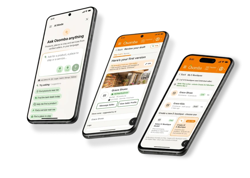
Two new features for a mobile-first marketplace launching in the Democratic Republic of the Congo: Ask Osomba, an AI search, and an AI E-Boutique Builder for sellers.



THE CONTEXT
Buyers on budget phones and slow 3G, many of whom read little or not at all, had no search built for them.
Osomba mixes commerce, short-term stays and services in one app. Its buyers often use budget Android phones on slow, expensive connections, speak one of six launch languages, and many read little or not at all.
Many also trust WhatsApp and cash more than a formal checkout. So search had to be fast, voice-friendly and visibly trustworthy.
RESEARCH
Built on the previous team’s user research.
User research for this market was led by the previous design team. By the client’s decision, new interviews and user testing weren’t part of our scope, so every design decision was grounded in that team’s research. I audited their handoff, studied about 35 Alibaba AI Mode screenshots against Jumia and WhatsApp sellers, and logged every client decision in writing.
6
Launch languages, with automatic detection
Client decision
30–48%
Estimated illiteracy in some regions
Secondary research
360px
Minimum screen width, with 48px tap targets
Design rule
What shaped the design
- Insight 1 · Dense layouts read as “complete” in this market. Density had to come from icons and badges, not heavy images.
- Insight 2 · Sellers price in USD, CDF or FCFA. Buyers need the seller’s price plus an approximate conversion.
- Insight 3 · Trust must be explained, not decorative: verified sellers and “Protected Payment” in plain words.
See the synthesis (from the previous team’s research)
USER FLOWS
Two features, two flows.
Ask Osomba had to work on a budget phone on 3G, so the flow includes no-results and offline states from the start.
The E-Boutique Builder keeps the seller in charge: the AI suggests, the seller decides.
ASK OSOMBA · BUYER
IF SEARCH FAILS
E-BOUTIQUE BUILDER · SELLER
WIREFRAMES
From sketch to screen.
I worked from Team 1’s handoff, sketched both features in low fidelity, then took 15 Ask Osomba screens and the nine-step builder to high fidelity.
VISUAL IDENTITY
Designing inside Osomba’s brand.
Osomba came with its own brand. I designed within it and tuned it for budget phones: 360px minimum width, 48px tap targets, and every icon paired with a word.
PRIMARY
#F67C01
SECONDARY
#26661F
ACCENT
#8FE868
NEUTRAL
#252525
THE SOLUTION
The solution
01
Ask Osomba (AI Mode)
15 screens: type, speak or photograph what you need. Results grouped by listing type, conversational refinement like “find something cheaper”, plus no-results and offline states.
SOLVES INSIGHTS 1 + 3
Built for low literacy and low data
Every button pairs an icon with a word. Skeleton loading instead of spinners, cached results offline, and trust badges that explain themselves when tapped.
03
AI E-Boutique Builder
A seller describes their business, the AI suggests a storefront type, theme and description, and the seller reviews and publishes. Plus three buyer storefronts: Commerce, Booking and Inquiry.
A CLOSER LOOK
Look into the app
Search by voice or photo
Mic and camera sit beside the text field.
Grouped results
Products, stays and services in separate rows.
Trust badges
Tap to see what Verified means.
Two prices
The seller’s price plus an approximate conversion.
SCOPE STRATEGY
The leadership moment
135
team hours left when requests kept growing
2
features per designer: one harder, one lighter
1
documented Phase 2 backlog for the next team
- The client kept adding features faster than three part-time student designers could deliver.
- I mapped every feature against our remaining hours and proposed a scope we could deliver at quality. Everything else became a Phase 2 backlog with specs.
- The client knew what to expect, the team stayed within its hours, and the next team won’t have to redo discovery.
Quality over quantity. I’d rather hand over two features developers can build than six they can’t.
WHAT’S NEXT
What’s next
Usability testing with buyers in Kinshasa, which the client scheduled for Phase 2, the full Business and Individual seller dashboards, and the Osomba Academy page.
What I’d do differently
Ask the client early for a few remote buyer conversations, to confirm the previous team’s findings before high fidelity.

NEXT CASE STUDY
FeaseBack to the start: my first product, built for a community I know well.